


Fixing the NHS: the digital arts and getting the right numbers. #Health
The 3 Es: employment, ‘ealth and education


Photo by Scott Rodgerson on Unsplash
Finding the right numbers and using them well is critical to fast-flowing high-quality care but it’s an area where the NHS struggles. We need to think carefully about:
what numbers are needed,
what can be generated on the journey,
what can safely be estimated to get started.
This post is all about numbers.
In Lean Thinking, Womack and Jones report how manufacturing improvements stalled in the last century because waste didn’t show up in the numbers – it was invisible! Goods travelled from plant to plant and each plant’s performance was carefully optimised. However, nobody watched the cost of transport, warehousing, or spoilage seeping through these extended supply lines.
Value streams focused on the added value of every step in a product’s journey, transport and storage as well as manufacturing. Huge losses showed up under this spotlight, and industrial metrics were redesigned to tackle the newly discovered waste.
Similarly, NHS data is collected to monitor and sustain today’s practices, but almost nobody sees the end-to-end journey (except patients). Most waste is invisible, particularly to auditors.
Start with demographics and epidemiology
Your centres must serve the needs of the population, not of the service provider. However, your data won’t tell you what one-stop pathways will make the biggest impact, because population data isn’t stratified that way.
You can tell how many are waiting for test X, or treatment Y, but tracking back to the presenting symptoms or creating end-to-end journeys just from the data is difficult. For instance, I once encountered several separate clinics in different departments, all for headaches.
First, then, find the fewest pathways needed to serve 4,000 patients a month – the fewer, the better – for 2 reasons:
cost;
adverse incidents.
A golden rule in any industrial process is that the more you do, the cheaper it gets. It’s a powerful trend in other sectors but largely ignored in care provision. When we started to research MedTech, we were told it would not exist because health was different. We found the evidence, anyway: Marketing Innovation: Medical Device Prices Follow the Experience Curve.
When I was in R&D our rule of thumb was that the unit cost fell to 80% of its original value every time you doubled the number of widgets. Whether the actual number is 70% or 90%, it’s a big driver for standardisation. Similar rules apply in service industries, as the home shopping boom demonstrates. These savings are the aggregation of many small breaks and design opportunities as volume increases, but the gross trends are amazingly consistent.
Applying this logic – and generalising wildly! – a single pathway of 4,000 patients/month will cost about 80% less than running a centre with 2 pathways serving 2,000 patients/month. By the time you are up to 8 pathways, you’ve doubled the running costs of your centre!
The second drive for large flows is that the percentage of adverse incidents also declines as the volume of patients goes up. My instinct is that there should be a rule that runs like 1/√N, where N is the size of the patient stream, but I can’t find much research in this specific area.
It’s a complicated trade-off: what is the fewest set of processes that will close a pathway for 4,000 patients a month?
Every time you add a new service line or variant, your costs rise and the centre becomes a little less safe than it was.
By the end, you want a ranked list of pathways in order of the number of patients who would benefit most. This will vary regionally, so you may have to mix and match, perhaps with a national core and local options, so that a cluster of two or three centres could cover 6-8 of the most common needs.
Setting targets
Next, compress everything into half-day sessions and set target costs. Targets must be radical and yet remain acceptable to staff, since our beliefs usually limit what we achieve. Henry Ford noted – variants exist – that whether you thought you could or whether you thought you couldn’t, you were probably right.
When I first got into health information, we were focused on modest impacts. Customers bought IT and let a few clerks go. I distrusted this buy-and-fire value proposition and was convinced that comms and IT could boost productivity by tens of percent, which was too big a leap. Even today, nobody anywhere has fully liberated the value of information in health, largely because they can’t quite believe it’s there.
Most people in or associated with the NHS believe improvements can be made. They’ll tell you how to shave a few percent off the time or cost spent on their patients. But you want to halve the cost of care for these cohorts and eliminate almost all their waiting, so you need to reframe the challenge and convince staff that radical improvements are achievable with superior design methods.
Models and numbers
When I left industry and started as professor, I wrote up my thinking and submitted it to the BMJ. The editor, Jane Smith, liked the ideas but couldn’t publish them in that form: could I take it not as a rejection but as an opportunity for a deep edit? I toddled off to a group at Southampton University, and our rewrite was published as, Using industrial processes to improve patient care (2004). Twenty years on, it is as relevant and largely unadopted as it was at the time.
Later, this team, with colleagues from the Universities of Cambridge and Ulster, won an EPSRC grant to study modelling in health, which showed how far health lagged other sectors. A recurring debate was over data and there were two extreme positions, both with merit. Sometimes, guesses are good enough: in fact, you almost always start with estimates. The opposite view is that you need excellent data for precise results.
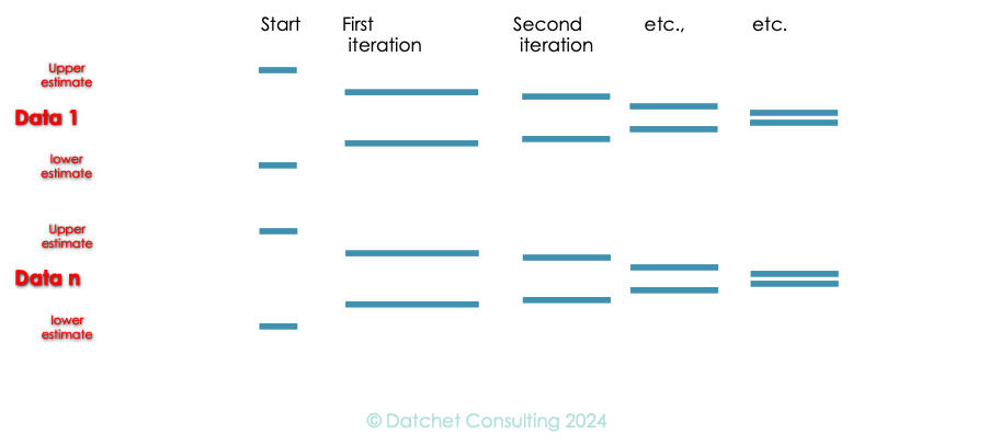
A compromise is to use two numbers for each parameter (from 1 to n) – a maximum (as high as you can imagine) and a minimum (below which you know it cannot go). Models run quickly, and many techniques use thousands of runs, anyway, so running the same model with high and low estimates in thousands of combinations gives you a good sense of the potential of your design. To begin with, the highs and lows may be a long way apart, but as the design proceeds and you discover more or find better data, the two should converge. At some stage you’ll decide it really doesn’t matter which is right and you can use either until to start to collect data from the real system in operation.
Some data needs to be right from day one, some can be guessed at until you can fill in the blanks. If you set up for a cohort of patients who don’t exist in sufficient numbers, then your whole centre is at risk. If you start by assuming you can get someone a CT scan – in and out – for £250 in 45 minutes and then work out how to do it in 25 minutes for £125, you’ll probably be OK.
But if the numbers don’t talk to you, find someone to whom they do and work with them.
Professor Young: researching for 40+ years, in healthcare for 25, and using NHS limbs for 50+.
The series
Fixing the NHS: hurdling todays barriers for a fitter future (25 July 2024)
Fixing the NHS: the digital arts and a simple knowledge model (1 August 2024)
Fixing the NHS: the digital arts and service design (8 August 2024)
Fixing the NHS: the digital arts and getting the right numbers (15 August 2024)
Fixing the NHS: making the virtuous vortex work (22 August 2024)
How to design a centre that closes 4,000 patient journeys a month for £1,000/patient or less, all in (29 August 2024)
Fixing the NHS: the bite-sized story in 6 charts (5 September 2024)