
Fixing the NHS: the bite-sized story in 6 charts. #Health
The 3 Es: employment, ‘ealth and education


Photo by Annie Spratt on Unsplash
Fixing the NHS properly could take decades, so we must buy time by launching a project to swallow up waiting, starting with the 7 million patients in the headlines. If we are clever, we may also free up resources. A one-off funding bolus is proposed to hoover up waiting and bring down the budget year on year, thereafter.
There are two mechanisms to drive this, and one by which it will fail. First, the bad news: the NHS will fail as it has in the past if it manages this as it has managed national programmes in the past. If the NHS can make this work by hoovering up existing waiters in less than 2 years and by continuing to consume waiting, that will alleviate pressure enormously. Plus, if the new methods percolate on through the service, it could surf a second wave of renewal and enjoy a double whammy of benefits.
Here’s a summary in 6 charts.
The original posts in order of publication were:
Fixing the NHS: hurdling todays barriers for a fitter future (25 July 2024)
Fixing the NHS: the digital arts and a simple knowledge model (1 August 2024)
Fixing the NHS: the digital arts and service design (8 August 2024)
Fixing the NHS: the digital arts and getting the right numbers (15 August 2024)
Fixing the NHS: making the virtuous vortex work (22 August 2024)
How to design a centre that closes 4,000 patient journeys a month for £1,000/patient or less, all in (29 August 2024)
Chart 1: Healthcare as a knowledge-relationship industry

This chart tells us that the shape of health services is driven by two types of knowledge. One – clinical knowledge – drives experts into clusters around knowledge-generating equipment. That’s why hospitals have grown into huge centres, often a long way from patients. The other – knowing patients – forces health workers out into the community.
Both cannot be satisfied at the same time, so we end up with a combination of well-equipped but widely separated facilities plus local facilities with more limited capabilities: top left and bottom right in our chart.
Over 7 million people are caught in the crosshairs of the current system, while many other hidden waiters languish in the top left or bottom right quadrant.
To alleviate the pain, we need a quick solution, which will have to be a hybrid solution that combines aspects of primary and secondary care. This means crossing boundaries: by boosting the capabilities of primary care; by extending the reach of secondary car into the community; or by doing something special for those in transit between the top right and bottom left quadrants.
Bringing 400,000 patients a month out of waiting with a clear diagnosis or by starting their treatment would clear the waiting in less than 2 years. I’ve suggested 100 centres, each clearing 4,000 patients a month and have used this as an exemplar throughout, but there are other options.
Although it looks simple, if you really grasp this chart, you are onto something profound.
Read more here.
Chart 2: A simple information model for healthcare
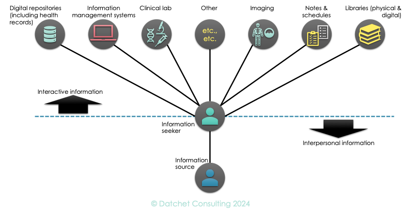
This chart reminds us that everyone in healthcare is an information seeker: patients, carers, doctors, nurses, physios, managers, receptionists – everyone needs information for their next decision. Where does it come from? Answer: from two sources – one based on data and one based on relationships.
The top half of our chart looks familiar, with written and digitised material, guidance, case studies, and so forth, presented in a variety of formats that can be interrogated. Sometimes the knowledge may be added to or modified by users. Sometimes it comes from machines, such as scanners or diagnostic equipment.
The bottom half reminds us that people discuss what is needed for diagnosis, treatment and rehabilitation. It’s not like a quiz with simple questions and responses: such knowledge usually emerges through conversation, consultation, sometimes debate. Some participants will only realise what their contribution is as the conversation develops.
Remember: top half interactive information; bottom half, interpersonal.
Read more here.
Chart 3: The knowledge-process vortex in health

Electronic computing emerged from World War II and this enigmatic child has carried all before it. Today’s industry is only about two things: what you know, and how you turn that knowledge into a product or service. It’s a cycle, because better process enables better knowledge to be gleaned, which in turn drives better process design.
Although healthcare is profoundly knowledge-based, it has not really grasped this vortex or used it to hoover up waiting lists. To be fair, the NHS has launched huge initiatives to tackle each side of this cycle but has been unable to engineer a sustainable solution. Read more here
A new service will depend upon making this vortex work, not just in a theoretical way, but in the harsh reality of delayed care.
Chart 4: Digital design.

Cycles are central to success, since working vortices don’t happen by accident and cannot be sustained without deep insight, which comes from having a robust design method.
The most embedded NHS design method is probably the Plan-Do-Study-Act (PDSA) cycle, one of the most primitive and, some would argue, intellectually flawed. I don’t really care what cycle you use, because if you apply it consistently, it will self-correct over time, even if it is slow to converge on a good solution.
I do care that your method is cyclic, because we are long past the time when anyone could specify a system and make it work in one go. Today, you must try something, see where it goes and modify your plan. Also, very few problems are ‘green field,’ so you are usually modifying something huge that is already evolving to its own rules.
The game changer is the use of prototypes, and digital prototyping is the fastest, cheapest and most powerful way we have of exploring how complex systems will change the problem we are tackling. Scenario modelling predates computers with table-top wargames using dice. You’ll fail without a robust design cycle that relies upon some sort of prototypes, so read more here.
Chart 5: Getting the right data

This chart reminds us that the data you want probably doesn’t exist in the right form, because our information systems are structured to support today’s care. Getting started will involve a mix of estimates from experts, and by combining (data fusion, for example) different types of information to get close to the numbers you want.
In a design cycle, you can afford to start with poor data and refine it from there. I’ve proposed that you work with a pair of limits for each parameter (one too high and one too low) and watch them converge as your design cycle gains traction.
Read more here.
Chart 6: The knowledge worker to close 400,000 patient journeys/month for less than £1k/patient, all in.

This chart reminds us that we need a better picture of how people will work in future. It’s all about knowledge and logistics! Whatever you build, it will need to provide workers with access to all the information they need within seconds and with good connections across their communities. This means access to great equipment and patient access to great facilities. It also means a much more intentional use of transport and logistics.
To get started, read more here.
All the best!
Professor Young: researching for 40+ years; in healthcare for 25; and using NHS limbs for 50+.
The series
Fixing the NHS: hurdling todays barriers for a fitter future (25 July 2024)
Fixing the NHS: the digital arts and a simple knowledge model (1 August 2024)
Fixing the NHS: the digital arts and service design (8 August 2024)
Fixing the NHS: the digital arts and getting the right numbers (15 August 2024)
Fixing the NHS: making the virtuous vortex work (22 August 2024)
How to design a centre that closes 4,000 patient journeys a month for £1,000/patient or less, all in (29 August 2024)
Fixing the NHS: the bite-sized story in 6 charts (5 September 2024)